In continuation of my previous post, Pentagram also have amazing data visualization projects. This might be a helpful inspiration for project three!
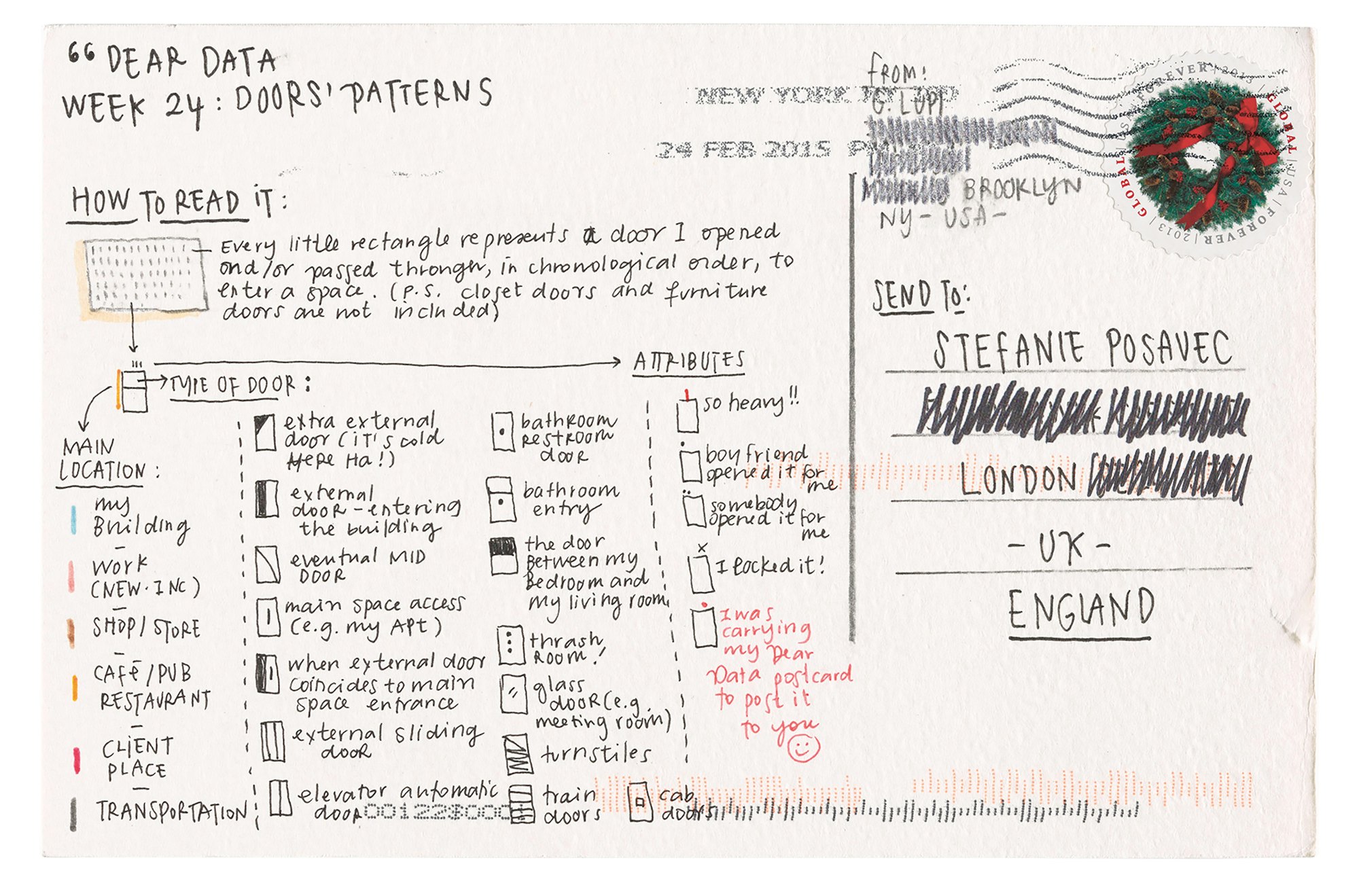
This particular project by Giorgia Lupi, one of Pentagram’s newest partners, is especially inspiring to me (and pretty directly related to our project). Lupi and Stefanie Posavec created visualizations of personal data collected through a week and mailed them to each other. These postcards functioned as intimate illustrations of their respective lives, bringing them together as friends, and also documenting their lives in an interesting way.

soooooo genius,,,,, actually in love with these drawings + ideas. hope you all enjoy as well…!!!

oooo!!! i read the book that came out of this project and i was meaning to post about it!! i’m so excited that someone else has seen this A+ work of data visualisation
LikeLike
This reminds me of instructions on a Sol LeWitt drawing. His images were pulled out of a systematic visual interrogation of lines instead of mapping some external factor. Both are crazy though. I want to read this book!
LikeLike