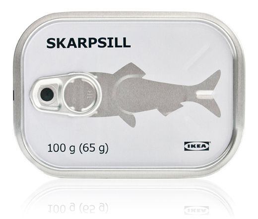
Ikea Package Design Posted by jonathanxuexue on September 25, 2019 This is too dope. Literally makes me want to cry. Ikea is one of the coolest companies in terms of branding! This particular one is my absolute favorite. The pull tab is placed to look like the head of the sardine! Hope you guys like it. Share this:TwitterFacebookLike Loading... Related

So funny. It is so hard to design something this simple and clever.
LikeLike